Format Artspace
Visual Identity
Format operates both as an artspace with artworks in editions and as an agency for artists and art projects – both from the premises in Nansensgade.
Editions
Format Editions is dedicated to artworks experimenting with media and material. The works are of high quality but can be acquired at a reasonable price, based on the principle that being an art collector is not reserved to a small closed circle of connoisseurs with the economy in order.
Agency and PR
Format Agency helps artists and artistic projects to get off the ground. Working together with a number of established artists, where the strategic sparring around concrete projects, diffuse ideas or career considerations form the backbone. Format PR Agency promotes the artistic or cultural projects, with a special understanding of art’s properties combined with experience and objectivity.
Objective
The task was partly to highlight that Format consists of two departments operating in the art world in different ways; the Art Space ‘Editions’ with exhibitions and sale of works of art created through serial production and ‘Agency and PR’ as the basis of artistic professionalism helps develop artists and promote cultural projects. And partly to develop a visual identity with an expression that emphasizes the story of Format as a place where everyone is welcome no matter what size budget you have in your pocket.

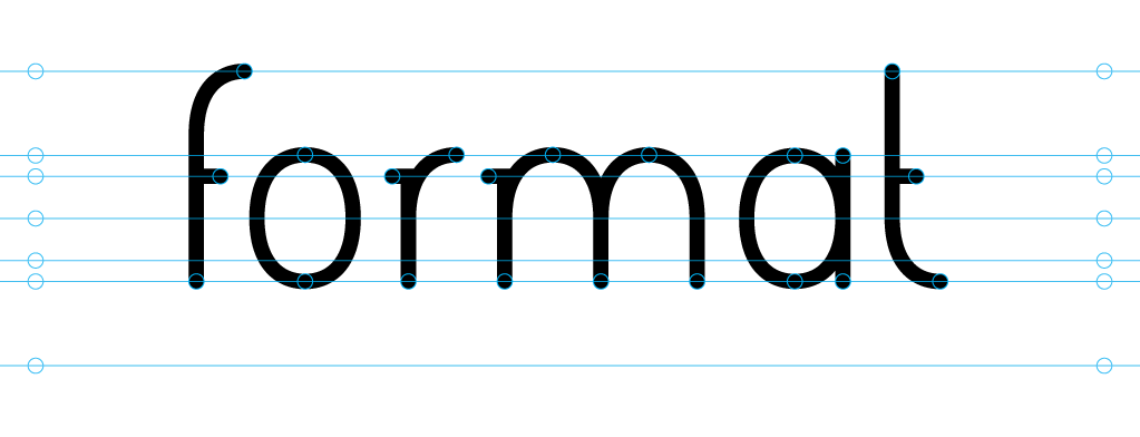
The custom font
The font was developed heavily inspired by Formats ambition to produce works of art in a manner where costs are kept down and thus making the price of the artworks affordable for all.
The model was a simplified version of the classic typewriter font, which has a simple, informal and tactile expression. Values, all of which are in line with Formats desire to meet anyone interested in art at eye level around the tangible work of art without snobbery.
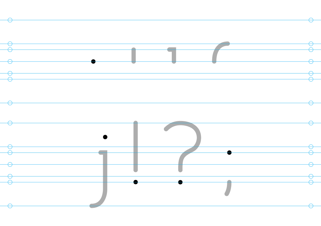
The building blocks
All glyphs (letters, numbers and characters) is, as far as possible, only combinations of the same four basic elements of the same thickness; tittle, stroke, bowl and serif. The process thus becomes extremely efficient and makes the font able to be produced cheaply without losing its distinctive character, in the same spirit as the works in Format be made cheaper through the use of serial reproduction methods (eg. Screen printing, 3D printing etc.).
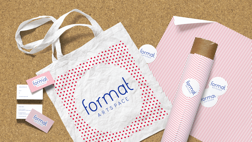
Textures and colors
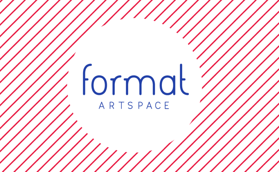
The visual language for the two departments is inspired by the expressions of traditional serial reproduction methods and measures. The red and blue color adds an element of weirdness to the otherwise very clean and stringent graphic design and makes the expression more informal and welcoming.
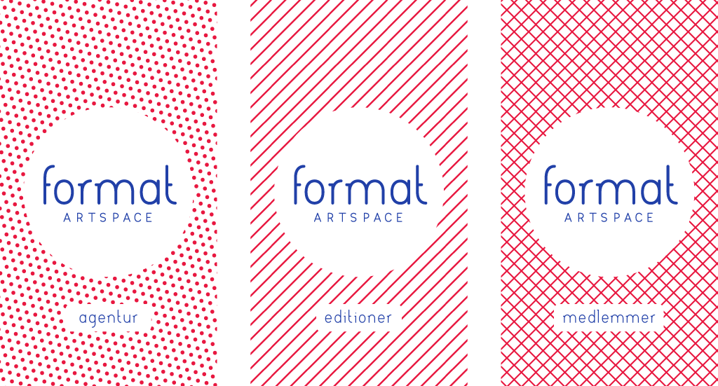
Editions: Hatching – refers to the serial production; layer upon layer of sheets.
Members: Crosshatch – adds an extra layer or merge as a reference to the relationship between Format and its members.
Agency: Raster – The dots serves as a reference to people; artists in the community or in relation to their audience.
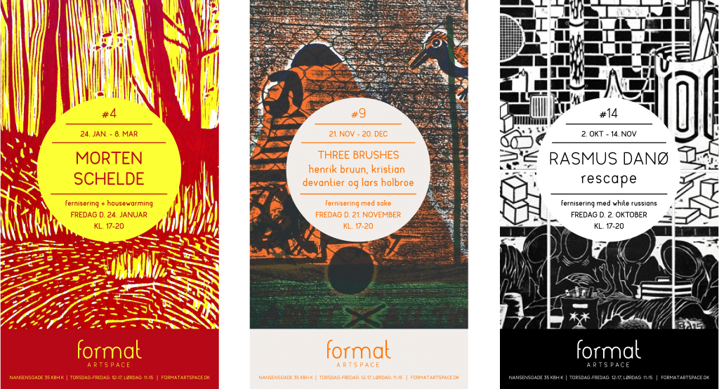
Invitations
Just as the graphic identity refers to the expressions of serial reproduction. The invitations for the individual exhibitions focuses on the artists distinctive visual signature and artistic methods and expressions.